

*New Resource* 2020 Census Data Mapping Portal for Buffalo-Niagara
You can now explore Census data by WNY County and County Subdivisions, NYS Assembly Districts, NYS Senate Districts, Erie County Legislative Districts and City of Buffalo Geographies, thanks to our Director of Research, Rusty Weaver.
On Thursday, 12 August 2021, the U.S. Census Bureau released decennial census data for 2020 to inform political redistricting processes, as required under Public Law (P.L.) 94-171. As part of its Good DEEDS and High Road Policy initiatives, the Cornell ILR Buffalo Co-Lab compiled block-level data for the two county Buffalo-Niagara region into a user-friendly, interactive dashboard that allows users to explore population changes for various political and administrative geographies.
Using the portal requires just four easy steps.
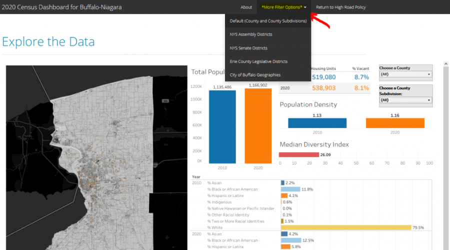
Step 1. Select a Filtering Option
The first step is to use the menu at the top of the portal to select a “filter option” to define the type of population change that the tool should display. At present, there are five options:
- County and County Subdivisions (default view). This option enables users to map and explore 2010 to 2020 population changes at the County level (Erie or Niagara), or for individual county subdivisions. County subdivisions in New York State are effectively “local governments…like cities and towns,” though there are some instances where subdivisions group multiple jurisdictions (e.g., the Town of Amherst county subdivision in Erie County includes the Village of Williamsville).
- NYS Assembly Districts. This option allows users to explore population changes in the nine NYS Assembly Districts (lower chamber of the NYS Legislature) that cover Erie and Niagara Counties. Note that portal only uses data for these two counties. If a state legislative district crosses into other counties, the infographics shown in the dashboard display will not include the data from outside of the two-county Buffalo-Niagara region.
- NYS Senate Districts. This option allows users to explore population changes in the five NYS Senate Districts (upper chamber of the NYS Legislature) that cover Erie and Niagara Counties. Note that portal only uses data for these two counties. As above, if a state legislative district crosses into other counties, the infographics shown in the dashboard display will not include the data from outside of the two-county Buffalo-Niagara region.
- Erie County Legislative Districts. This filter summarizes the population data for the eleven districts that make up the Erie County Legislature. Because a Geographic Information Systems (GIS) layer for Niagara County Legislative Districts is not publicly available, the portal does not feature a county legislature filtering option for Niagara County at this time.
- City of Buffalo Geographies. This filtering option contains three sub-options. Users can summarize and explore population and population change data for (a) City of Buffalo Common Council Districts, (b) City of Buffalo Planning Neighborhoods, or (c) a combination of (a) and (b).
Step 2. Apply a Filter
After a user selects a filter option, the portal display will update with the appropriate default map (on the left-hand-side of the dashboard) and selection box(es) (in the top-right corner of the dashboard display). Once the dashboard is loaded, use the selection box(es) at the top-right of the screen to select a desired geography. The example below was created by selecting the “Erie County Legislative Districts” filter option in Step 1, and then choosing EC LD-1 (Erie County Legislative District 1) from the dashboard’s selection box.
Step 3. Export and Share the Infographic
After creating a map and supporting data for the desired geography, use the toolbar at the bottom-right of the dashboard to export the infographic as an image that you can share on social media or copy into a document. (Please tag @RustBeltGeo and @buffalocolab on Twitter if you do decide to share your results!). As shown in the image below, the infographic can be downloaded as an Image (.PNG), PDF document, or PowerPoint slide.
Step 4. Repeat Steps 1-3
After creating an infographic or otherwise finishing with one map view, repeat steps 1-4 to create another (and another, and another)!. If you find the dashboard to be useful, or have other comments or feedback, please reach out and tell us!
For step-by-step images and to read more, visit the High Road Policy Blog about this tool here.